

Project details
Project type: UX/UI/SD
Output: Web app (mid-fidelity concept)
My role: Principle UX/UI designer
Company: Curalie GmbH (Fresenius Group)
Date: Oct–Nov 2023
Context
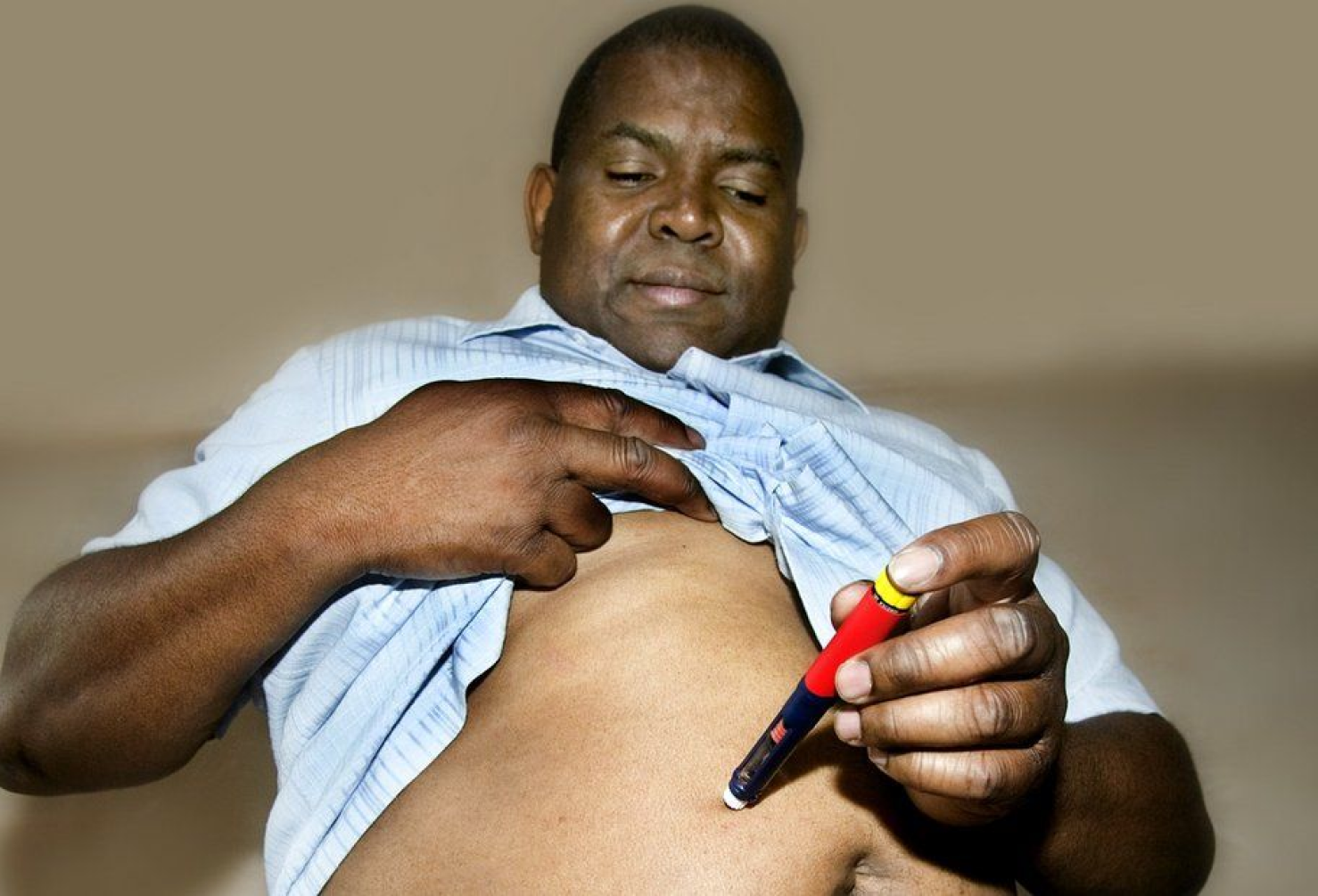
In Germany, factors such as income, education, migration background, or language barrier still hinder access to basic healthcare. The shortage of available doctor appointments doesn’t help either. As a result, many people can’t find answers to their health(care) concerns, identify important symptoms or manage therapy. The consequences are stark; an evident decrease in life expectancy in affected social groups is one of them.
What is a Gesundheitskiosk?
German Ministry of Health has recognized the issue. Gesundheitskiosks — the government’s new initiative — will be set up throughout the country. 1000 new healthcare facilities are to offer low-threshold advice and support, particularly in socially disadvantaged regions and districts. As per the latest regulations, Gesundheitskiosks will not substitute hospitals or GP's offices but support them. The goal is to guide people to the available solutions, institutions, and facilities. It is a building block of accessible and community-based primary care.
-
![]()
Education & prevention
A variety of activities to improve the physical and mental condition of the local population. Teaching the basics of effective prevention.
-
![]()
Preliminary medical assessment
Simple checks to direct the patient to the best-suited medical facility.
-
![]()
Therapy assistance
Supporting patients in their therapy management through accessible medical advice, progress tracking, and more.
-
![]()
Diagnosis clarification
Helping patients understand the diagnoses they received at medical facilities. If necessary, it is possible to work out the next steps together.
-
![]()
Health care system assistance
Help navigating through the German health system, medical records, and other challenges like language barriers.


The government’s idea of Gesundheitskiosk as low-threshold healthcare is new, simple, and dynamic. How can we create an MVP proposal that matches these characteristics?
Project goal
A concept of a highly feasible, scalable, quick-to-deliver, software for Gesundheitskiosks. This requires identifying the functionalities enabling Kiosk’s staff to complete their core tasks.
Research
The ultimate goal of the research was to pinpoint the key features the software should offer. We began our work by studying the Gesundheitskiosk Act in detail. This allowed us to identify stakeholders, capture the service’s intended scope, and understand its potential evolution.
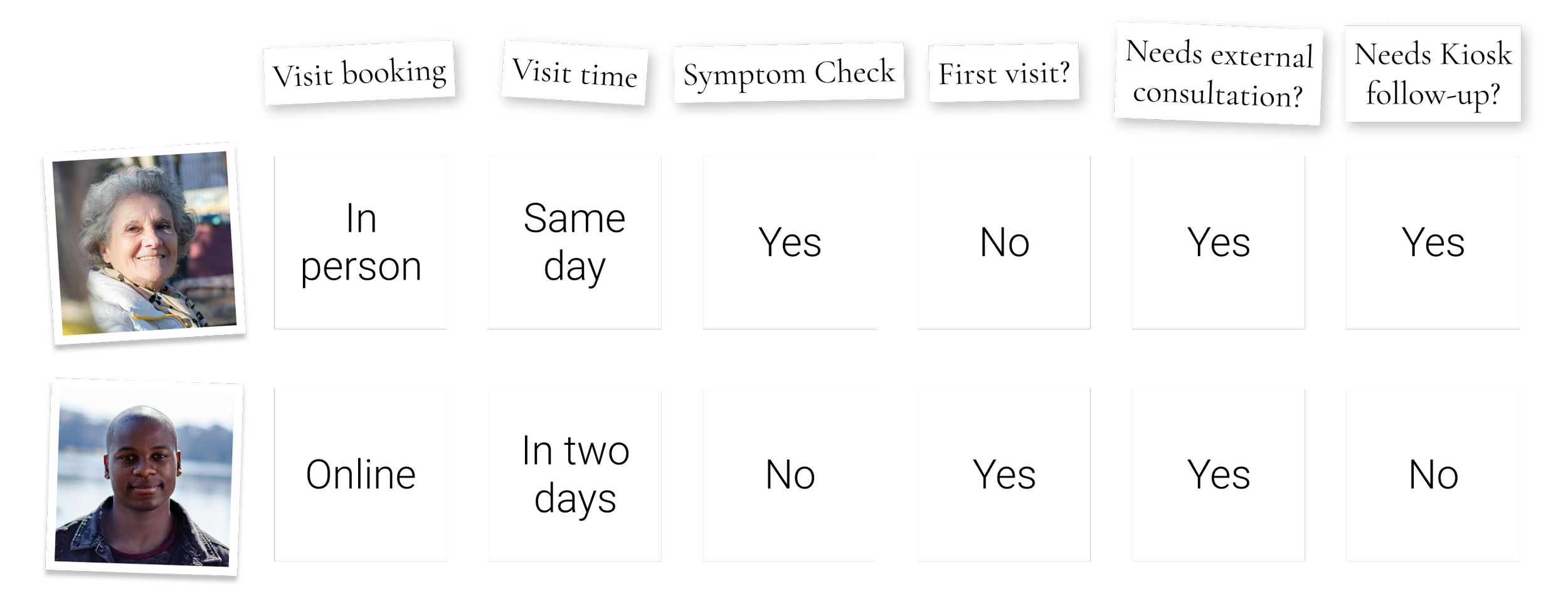
Our target group is Kiosk’s staff: nurses and social workers. At the same time, it's the disadvantaged people with health concerns who are at the initiative’s very core. We dived deeper to understand the perspective of both sides.
The reports on the model health kiosk — Gesunheitskiosk Hamburg Billstad/Horn — were a particularly rich source of information for us. The facility's activities along with its target group match the scope of the new law. Supported by statements from its employees and visitors, this documentation formed the backbone of our exploration.
Understanding the challenge
Based on the research, we drafted four mini-personas: two Kiosk employees, and two visitorors (see below). To promote in our organization a deep understanding of their needs, we augmented the personas with an empathy map

-

Amina, 50
Community Health Nurse (staff member)
Language skills
German, English, Arabic
Professional problem space
- Paperwork overload at the facility
- Not enough time for the visitors
- Team and case management
- Unclear relations with other healthcare providers -

Nikita, 30
Social Worker (staff member)
Language skills
German, English, Russian, UkrainianProfessional problem space
- Not enough time for the visitors
- Team’s inflexibility due to a complex schedule
- Complex cases require the support of medical staff -

Ute, 79
Kiosk visitor
- Outgoing, bubbly personality
- Lives in one of Berlin’s quiet neighborhoods
- Does not have a smartphone or computerHealth & social problem space
- Inconsistent with her diabetes therapy
- Unmotivated to change her lifestyle
- Feels a little lonely sometimes -

Jimiyu, 29
Kiosk visitor
- Moved to Germany from Kenya six months ago
- Studies Cloud Engineering
- Introvert, great observerHealth & social problem space
- Struggles with the German healthcare system
- Frustrated by the language barrier, as he does not speak great German yet
Empathy maps
User flow: a search for core features
Compiling our research and empathy maps with the government's expectations of the Kiosks, we started outlining possible user flows.
We decided to map the activities of employees and visitors on one flowchart. We wanted to know what the flow could look like for Ute and Jimiyu — our two personas. The fact that their journeys were significantly different at pivotal points of the Kiosk visit (see below) enabled us to investigate key alternatives.
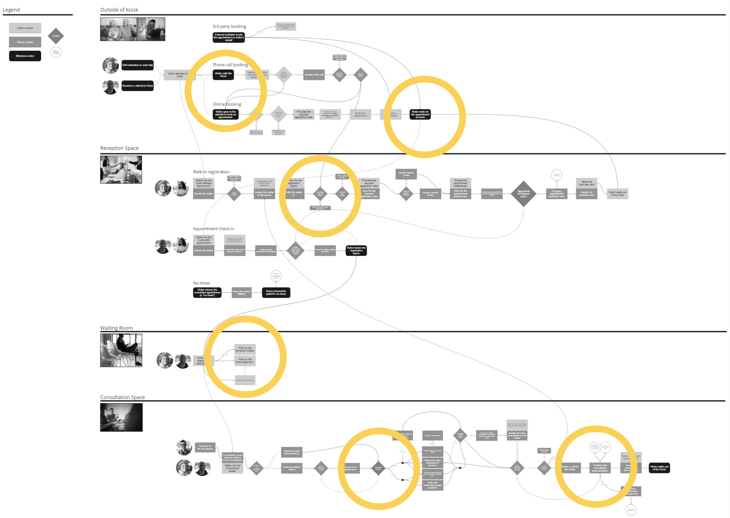
Key findings in the user flow
We quickly identified the main touchpoints for both user groups.
We understood how independent the two user groups are in the entire flow (e.g. which tasks could be delegated from the staff to the visitors?).
We understood the importance of the events taking place outside the Kiosk, for example:
Getting to know about Kiosk
Waiting for a scheduled appointment or deciding on a walk-in visit
Using the resources provided by the Kiosk during the visit
We recognized that forcing the integration of Curalie's digital features to such an extent might not be viable at such an early phase of the project.
At the same time, we observed that Curalie's digital solutions have potential at many points in the user journey — a strong argument for future product expansion.
Milestone
We identified the functionalities the software should provide for Kiosk staff and, indirectly, the visitors.
Ready to mock it up!
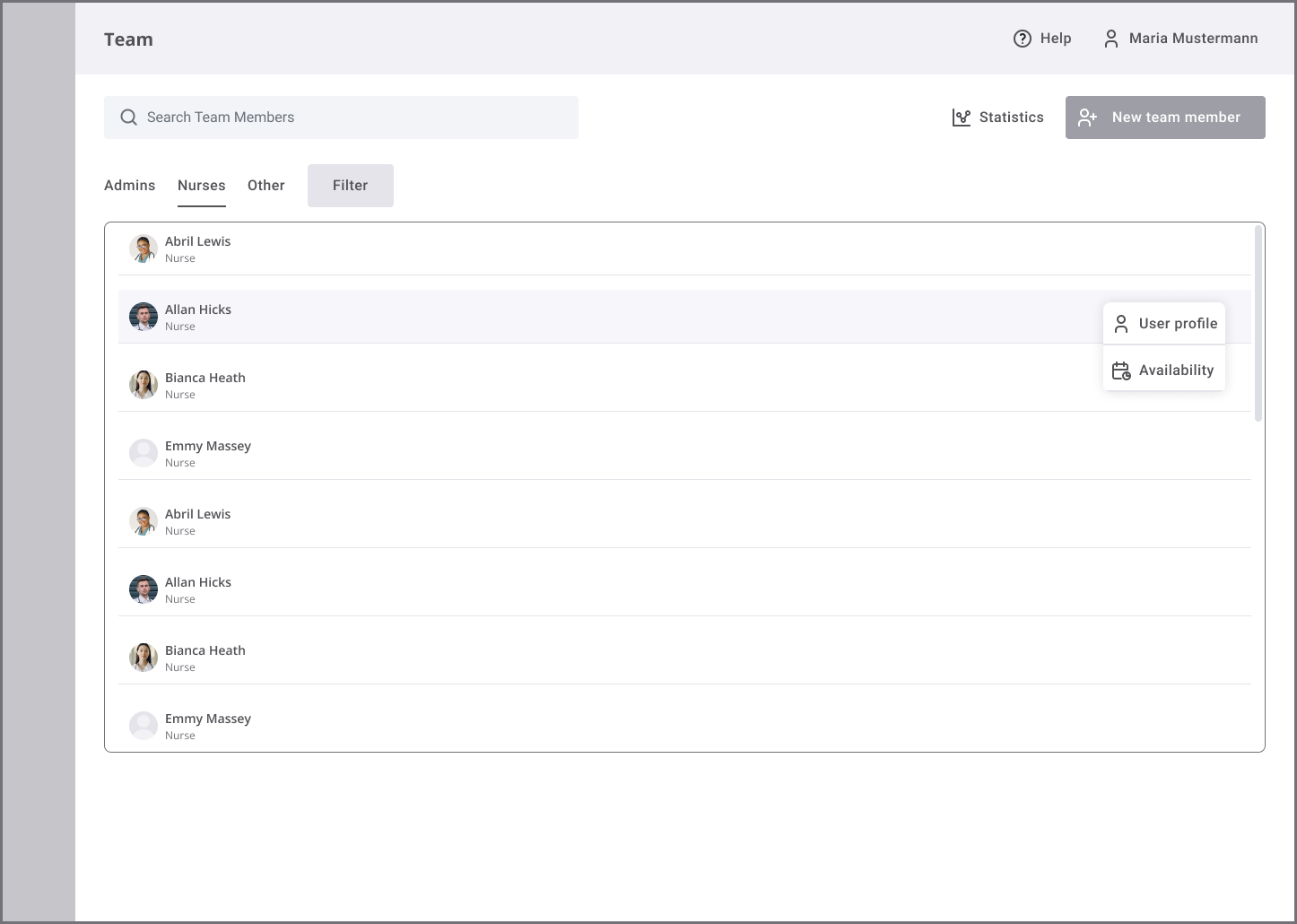
The user flow chart has greatly helped our organization reach the first important project milestone: identifying the core features to focus on and explore in the MVP:
Dashboard with shortcuts to the key features
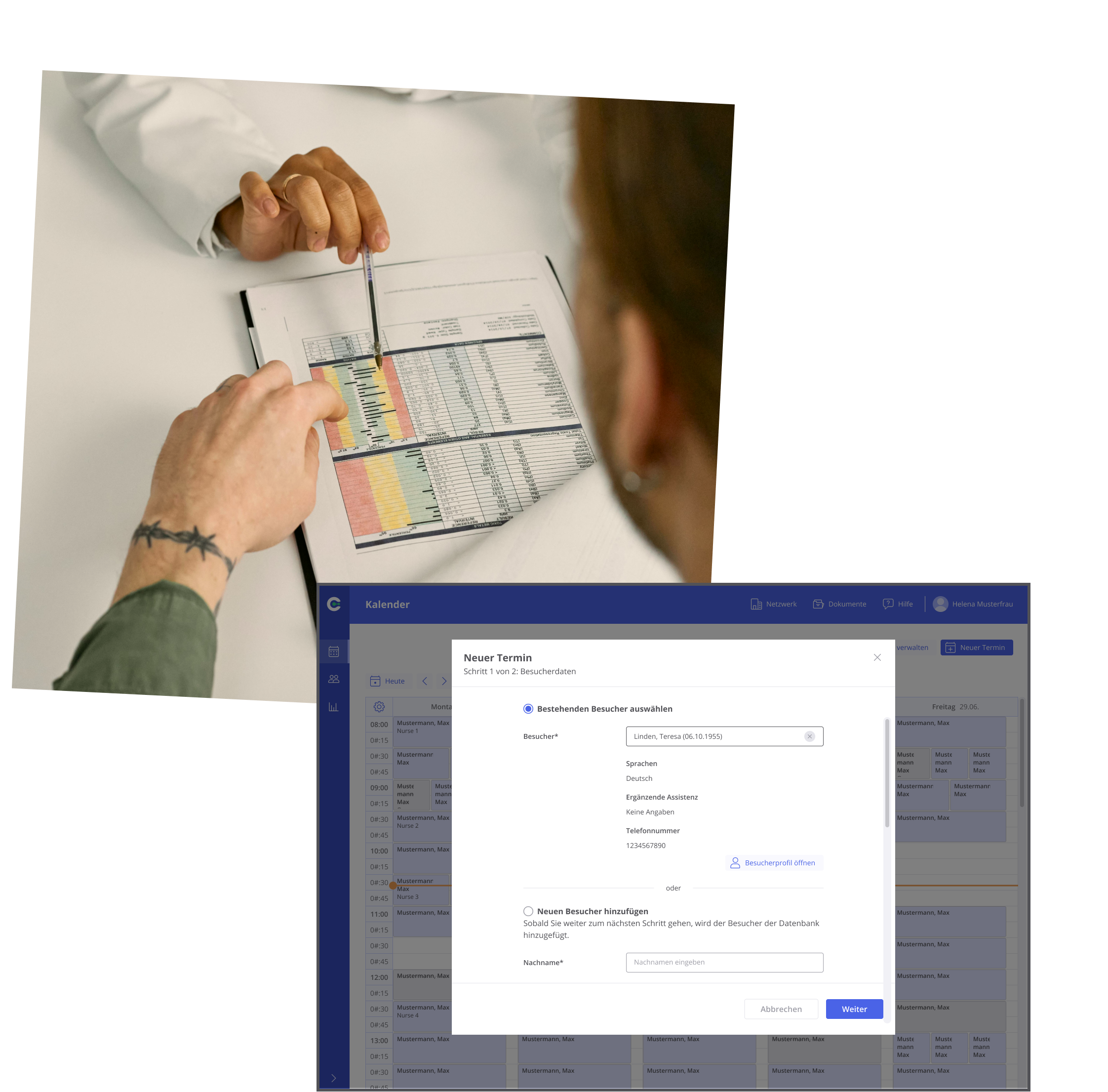
Team calendar for scheduling and managing appointments
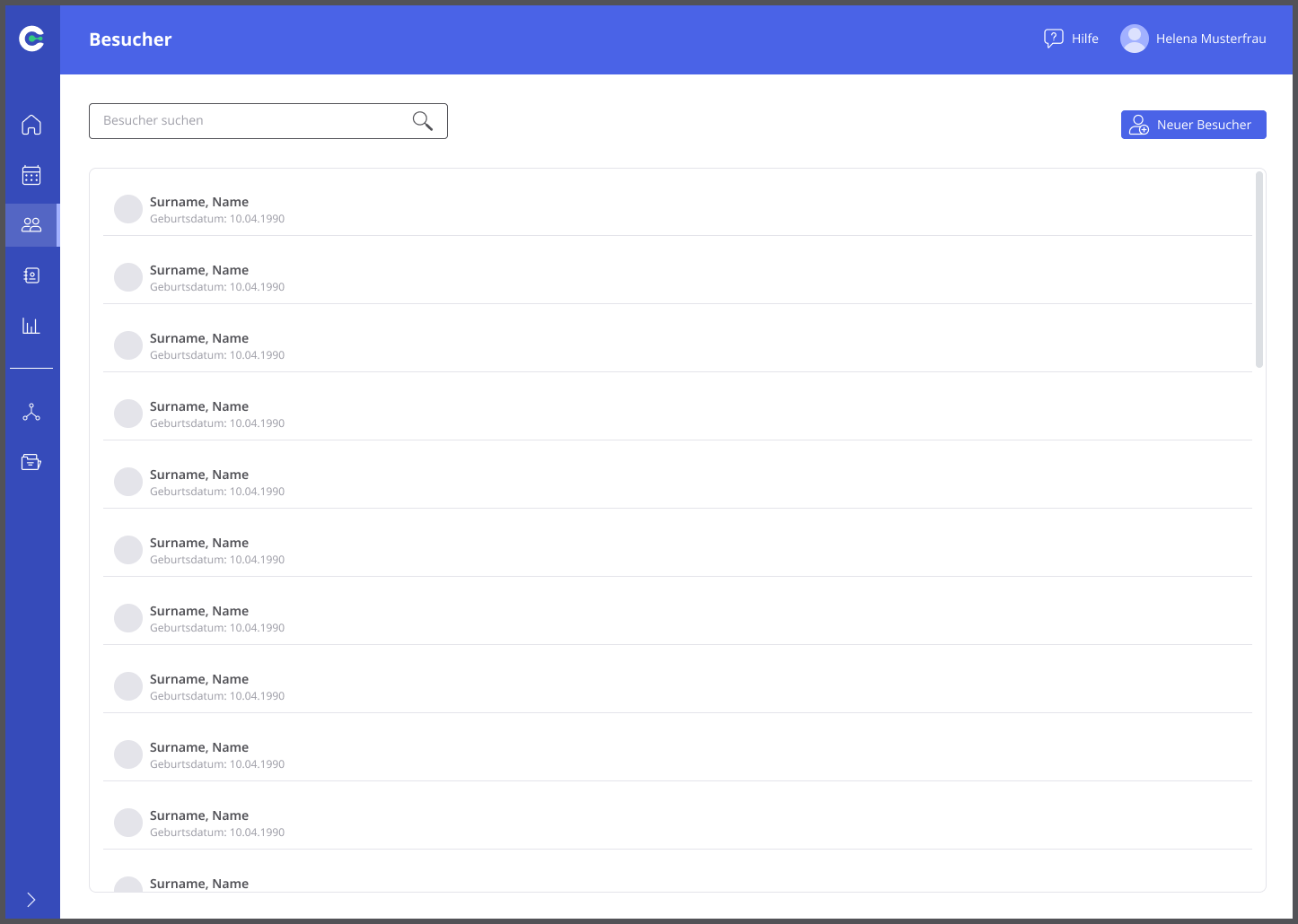
Employee and visitors index
Employee and visitor profiles
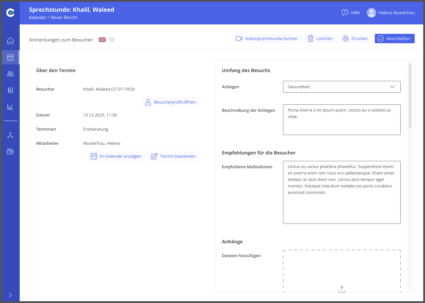
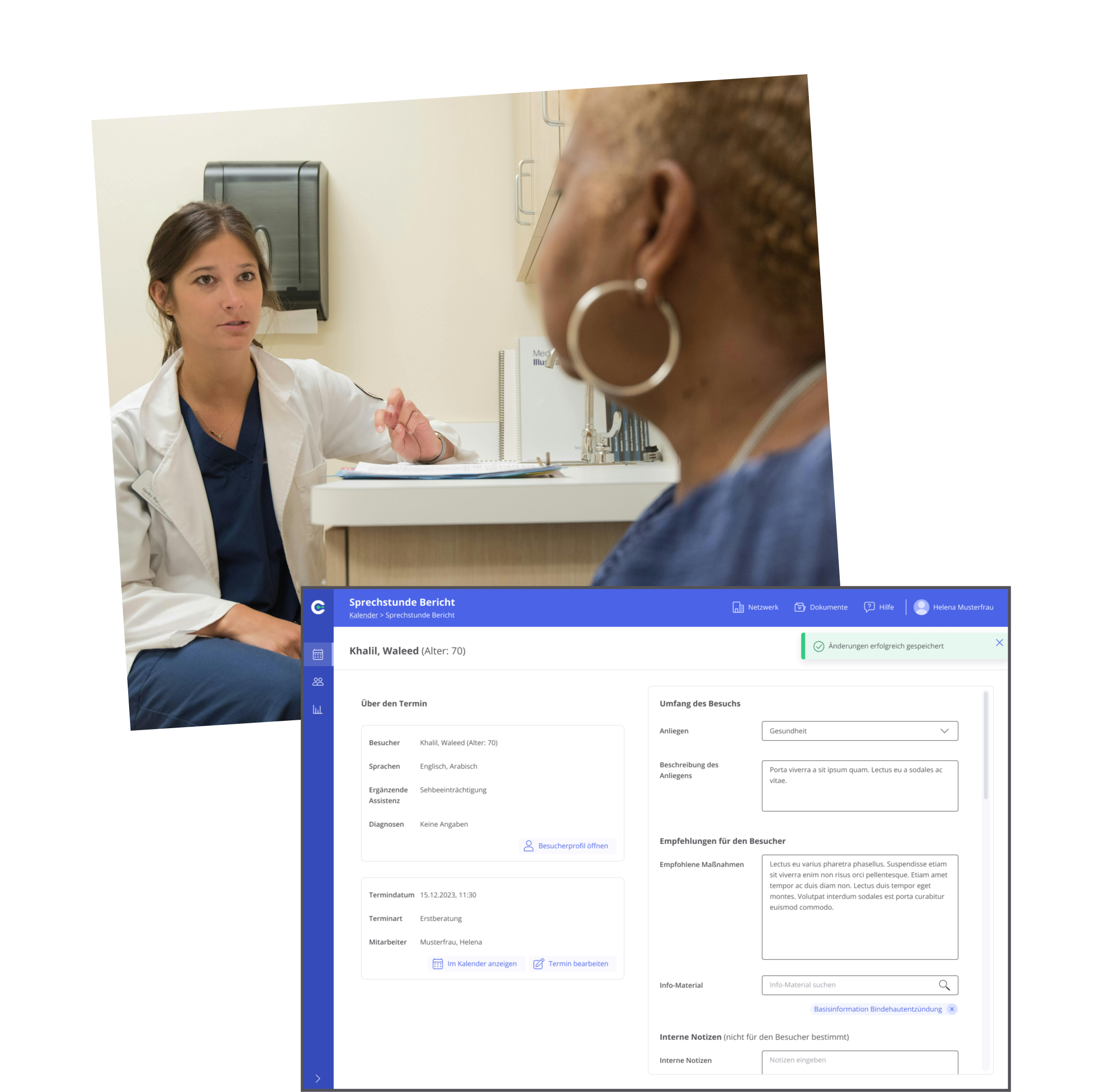
Visitor documentation
Kiosk performance analytics
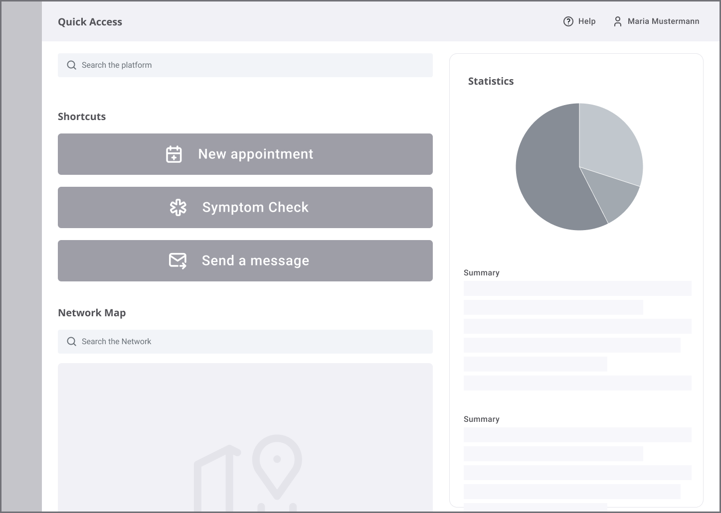
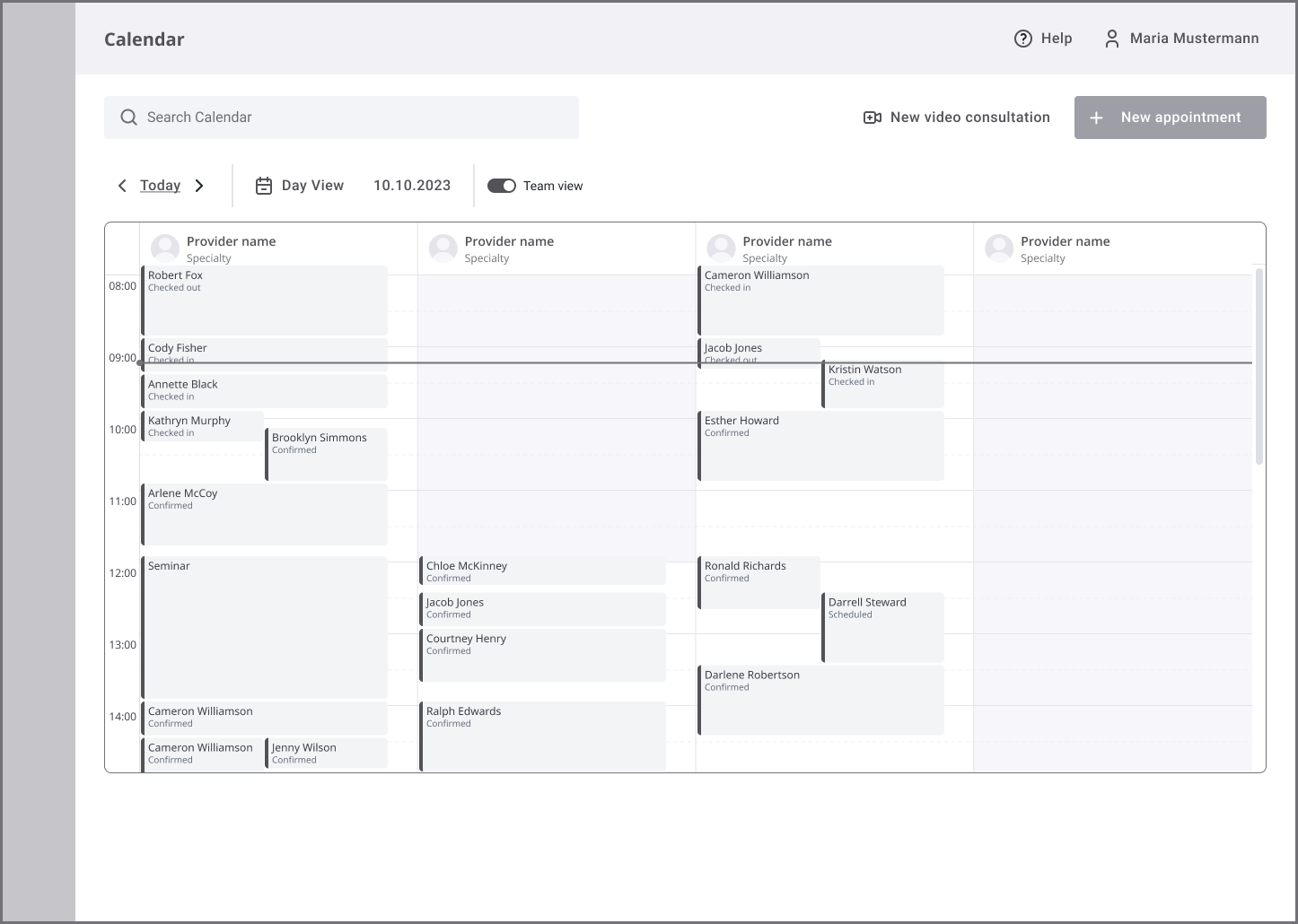
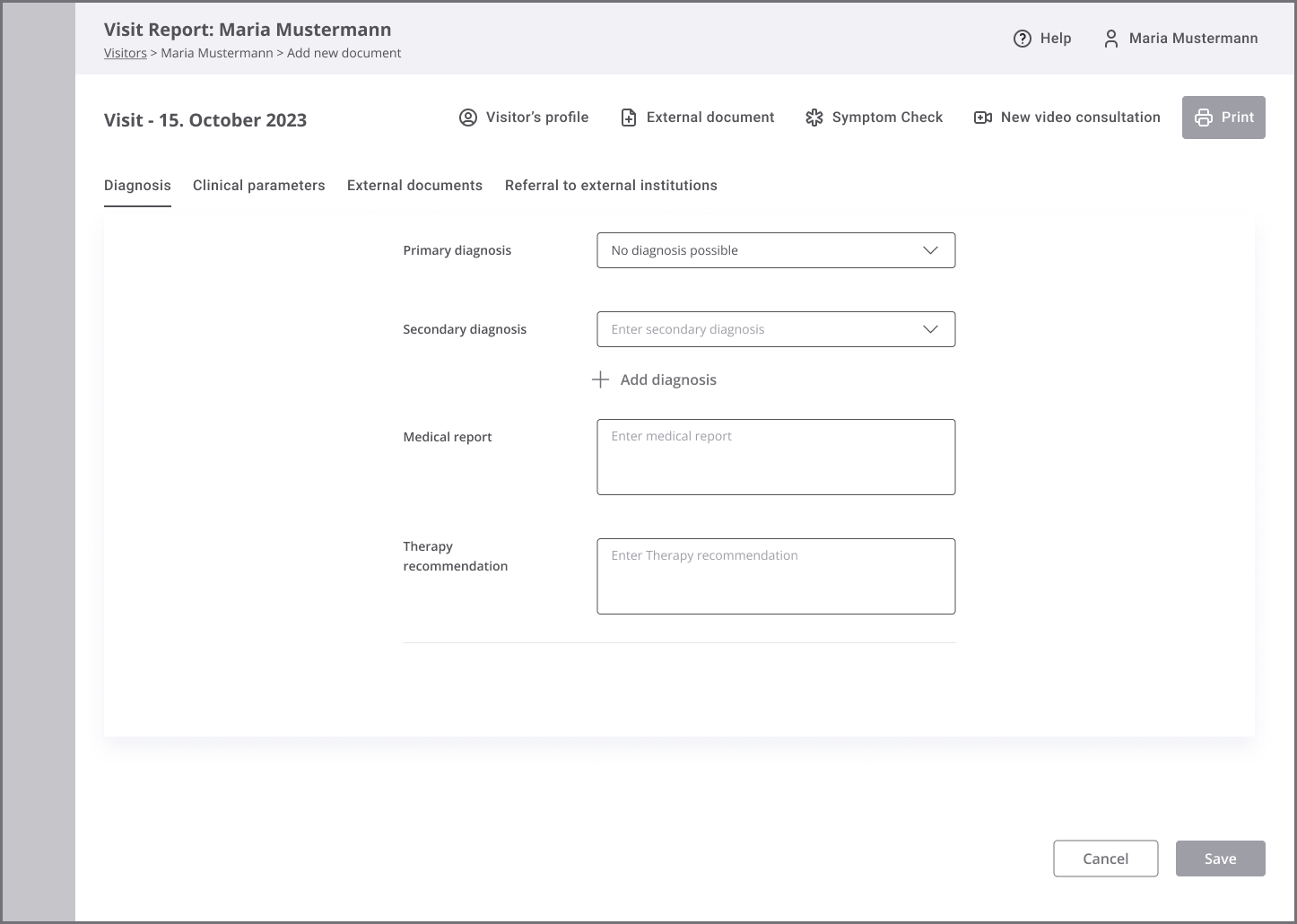
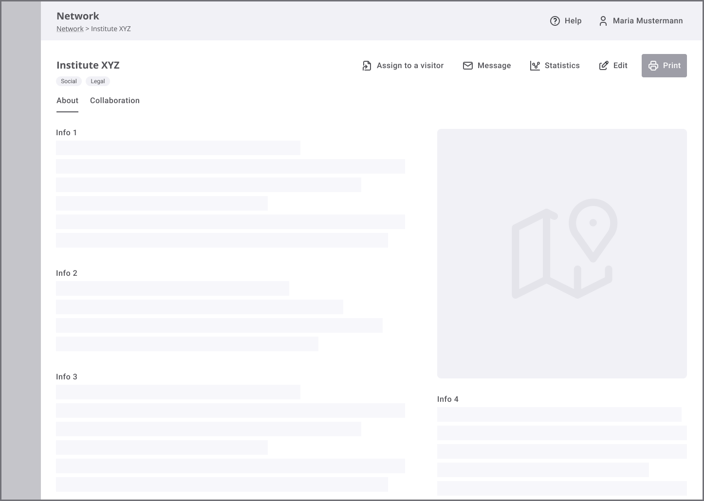
We began building the first mid-fidelity mockups for each of these functionalities (see below). These designs were especially useful in the early feasibility talks with the Dev Team.
-
![]()
Dashboard
-
![]()
Team calendar
-
![]()
Visitor’s profile
-
![]()
Visit documentation
-
![]()
Staff management
-
![]()
Healthcare network database: partner info

High-fidelity assets for usability testing
After we received the technical feasibility feedback, we promptly adjusted the concept and moved on to high-fidelity ideation. Our goal at this stage was to build a detailed prototype for thorough usability testing (see below). Additionally, the visually polished screens became an important asset for the sales and marketing departments.
-
![]()
Calendar
-
![]()
Healthcare network database: partner info
-
![]()
Visitor index
-
![]()
Visit documentation
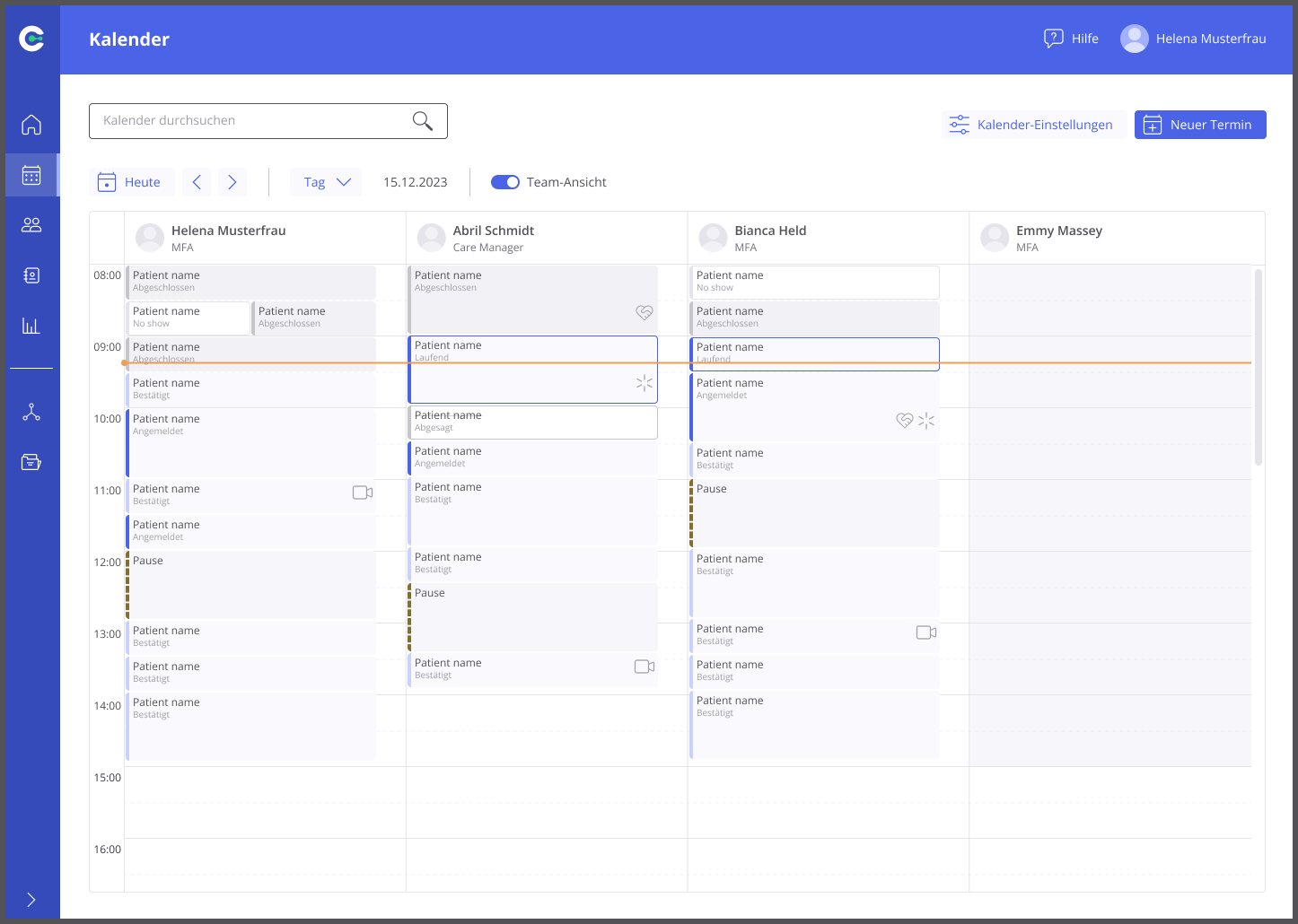
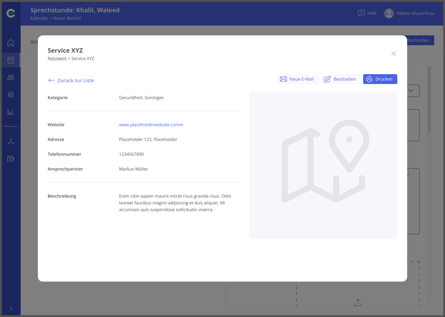
Turning flaws into solutions
Thanks to the usability check learnings, we were able to spot and address several design flaws. Some were minor and visual (e.g. visit documentation), while others (e.g. sidebar and calendar) called for major architectural changes.
Surprisingly, the calendar, although satisfactory usability-wise, came to be the biggest technical setback. A close collaboration with the engineers helped us quickly find good alternatives. According to dev estimations, tailoring the design carefully has reduced the expected implementation time by a staggering 50%.
MVP: the ultimate essence of the project
Lastly, working closely with the project management, we narrowed the design’s scope to its ultimate essence. The MVP would address the basic needs of Kiosk staff (see below), and we were able to develop it quickly. This iterated design made the most of what we already had in the library. Moreover, the entire concept had great potential for scalability — like the Gesundheitskiosks themselves.
-
![]()
Team Calendar
-
![]()
Two-step visitor registration
-
![]()
Follow-up appointment booking
-
![]()
Visit documentation


Top learnings
Scope unclear? Keep researching, don’t build.
This project required us to move quickly toward tangible solutions and feasibility checks. The exact scope though remained undefined until the last phase. As a result, much of the detailed work (mockups, prototypes, usability tests, etc.) was discarded.
In retrospect, I would have advocated deepening the initial research at the expense of ideating. This would have enabled a more informed and faster scoping. Additionally, a smaller test subject means faster testing and iterations. This in turn, in the case of our organization, would bring a significant reduction in the cost of the project.
Is there a plug-in for that?
The calendar — a part of the project that consumed the most effort, could have been… a plug-and-play third-party plug-in. That was surprising feedback we got from one of the developers. It was, however, too late to change our approach.
Building on our custom calendar stemmed from the premise that we should reuse existing assets as much as possible. The feature was hard to adapt, but it worked well in our other products. So we did not question it. Wrongfully so!
Could the dev give us this feedback earlier? For sure. He may have thought, however, that such an obvious solution had certainly been proposed by other devs right at the start.
My learning? Ask as early as possible: “Could this be a plug-in?” The initiative might save the organization time, money, and a lot of frustration.