


Project details
Project type: UX/UI
Output: Web app (MVP implementation)
My role: Principal UX/UI designer
Company: Curalie GmbH (Fresenius Group)
Time: Oct-Dec 2023
Context
A seamless patient-doctor-patient information flow is crucial for good medical consultations. This applies to in-person visits and, potentially even more so, to video consultations.
Crucial data should be exchangeable smoothly and accessible right when needed.
Problem space — overlooked patient input
To gain insight into the data that patients entered into the Curalie mobile app, doctors had to run a dedicated program (the Curalie platform) and search for the correct patient in it. However, due to doctors' busy schedules, slow computers, and a heavy cognitive load, only a few would open the Curalie platform to access the data.
This issue had negative consequences, both on the doctors’ and patients’ side. For example:
During the consultations, doctors had to ask patients for basic health and administrative information.
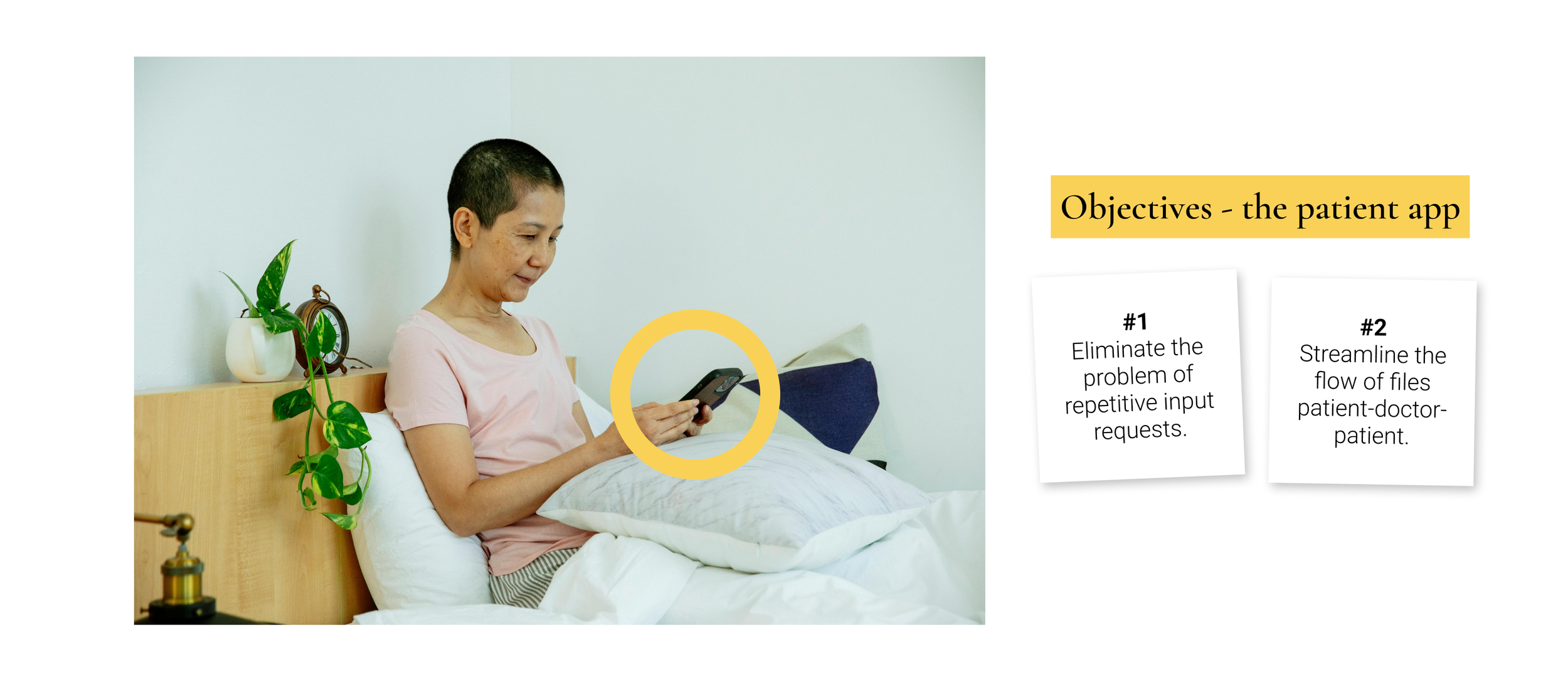
Patients had to share some information (such as medication taken) twice. First in the Curalie app in the health diary, and then again, verbally, in the video consultation.
Patients would also refer to information they had provided in the app, but which doctors had not seen.
Patients assumed they did not need to mention some facts about their health, as they had already stated them in the app.
Files from the doctors (e.g. a prescriptions or consultation reports) could not be received or viewed by the patients in the Curalie App.


Project goal
Enable efficient information exchange between patients (users of the Curalie app) and doctors - before, during, and after the video consultation.
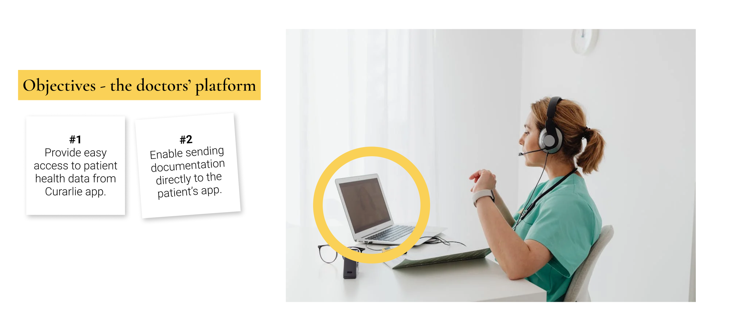
Objective #1
Craft a simple platform that ensures easy access to the information shared by the video consultation patients in the Curalie app.
Objective #2
Enable patients to receive all consultation-related files (e.g. prescriptions) in the Curalie app.
Constraints
Project timeline. We had a month and a limited team to design, test, and develop the platform.
Data security. Protecting patient information is the top priority. Ensuring medical data is easily accessible to doctors while maintaining the highest level of security is a delicate balancing act.
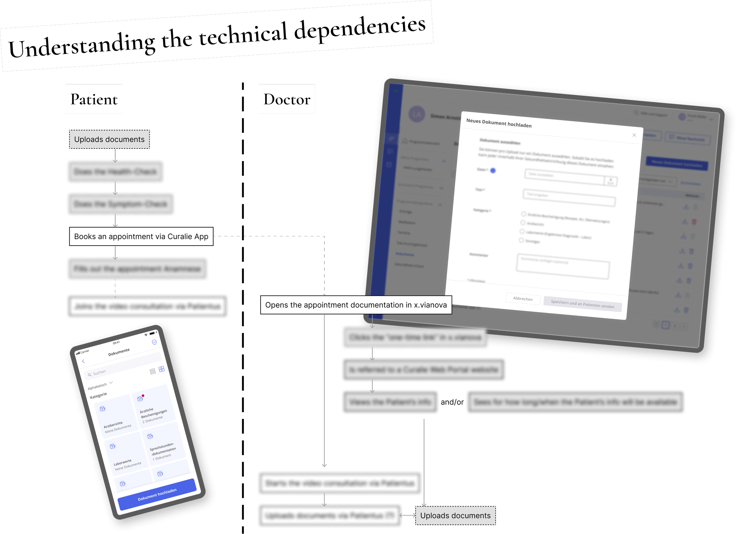
Integration into the software our doctors use. The new platform had to be integrated with x.vianova - a complex software for various medical administration tasks. Our doctors relied on x.vianova as the primary entry point for all consultations, including video sessions with our users. However, because of its complexity, interfering with x.vianova was technically tricky.
Research
Working closely with the doctors since long before this project enabled us to hit the ground running. From years of user research, we knew doctor’s preferences and frustrations. Our research team could focus on extensive usability and user tests early in the design process.
The steepest learning curve we faced was understanding the technical and functional dependency between x.vianova and other involved software.
Design
Instant MVP ideation
Meeting this project’s tight deadline would be harder, if not for its similarity to our other products. In the first iteration, we were able to leverage a great amount of existing assets. Nevertheless, we still looked closely into the usability of that new “patchwork”. Many old elements gained new functionalities in this design or were used in new combinations. All that posed a risk of major usability flaws.

Tests & iterations
Results of the 1st usability check: pump the breaks!
Working closely with developers, I created a high-fidelity prototype for the first usability check. The results of the test brought our attention to serious design problems. The information architecture required improvement. The “old” assets we used in this new project created numerous usability issues.
Despite the tight deadline, after thorough consideration, our team recognized that the best way to move forward would be to design the components we needed from scratch - as simply and efficiently as possible.
I worked quickly, teaming up with developers to keep the design feasible. Further usability checks and user tests confirmed that the new assets, while matching the look of the “old” existing library, greatly improved the entire concept’s usability and scalability.


Further improvements
Perfecting the file drop to save even more viewport space
Refined illustrations
Page header adjustments for clarity and patient data security
Error prevention for the file upload flow
WIP: More details coming soon
WIP: More details coming soon